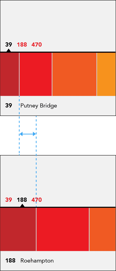
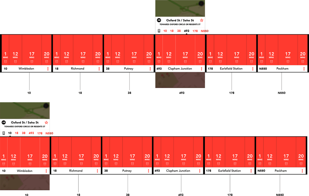
The Challenge

Transform complex transit data into a laser-focused experience centred on time.
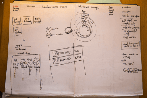
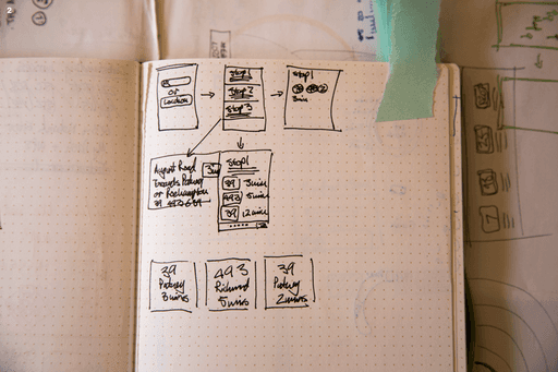
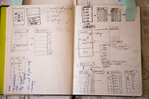
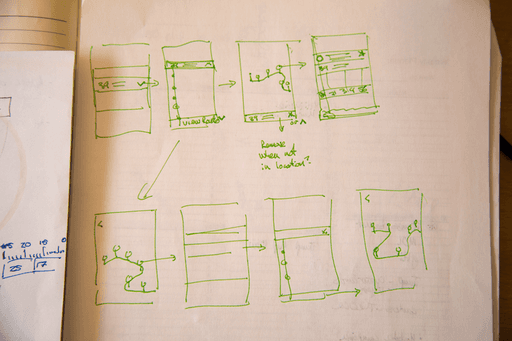
Every day, five million commuters navigate London’s bus network, often relying on data-heavy, utilitarian apps. With Jump, a project we designed and shipped from the ground up, the challenge was to leverage TfL’s Open API to strip away this clutter, transforming a mundane task into something fast, intuitive, and even delightful.

Team:

Ryan Shelton, Adam Shelton (Design), Marco Meschini (Development)

Ryan Shelton, Adam Shelton (Design),

Marco Meschini (Development)

Exploration & Iteration

Concept 1

Concentric Timers.

I experimented with circular progress bars to represent bus arrivals but discarded this because it added unnecessary cognitive load; users had to decode the circles rather than just reading the time.

Concept 2

The Next Bus Focus.

I explored showing only the single most immediate arrival, however, I soon realised commuters need a broader window (up to 30 minutes) to decide whether to leave the office or finish a coffee.

Concept 3

List-Based Search.

I also had the idea of searching for buses nearby or by a specific location, but felt users needed to get their bearings on a map first. Once a bus stop was selected, I focused on surfacing all arrivals on a single screen.

Pulse of the City.

Inspired by vintage ticker boards, I designed dynamic blocks that scale as an arrival becomes imminent. As buses depart, the list reorders, mirroring the physical movement of the network to make the app feel alive.

Back to the Drawing Board

Simplifying the simplicity.

Despite the progress, the initial designs felt too convoluted. I realised that to truly honour the laser-focus objective, I needed to remove as much friction as possible. I decided to start again, shifting my focus toward gestural navigation and dynamic information surfacing to reduce the tap count and surface relevant data instantly.

Make the app more fun to use

Make the app more fun to use

Make the app more fun to use

Gestures & Cards

I moved away from fixed screens in favour of a gesture-based card system. This allowed for a more fluid way to display or dismiss information without losing the map’s context.

Focus through Interaction

To reduce cognitive load, I shifted the focus to a single bus at a time rather than overwhelming the user with a full list. By tapping specific bus numbers, the card dynamically updates to show arrival times for that route, keeping the interface clean and the user's intent front and centre.

The Single-Tap Goal

Knowing that time is a commuter's most precious commodity, the entire UI was rebuilt to ensure that a user could reach their core arrival times in just a single tap.

Brand Identity

The Modern Routemaster.

The branding needed to feel quintessentially London. I moved away from generic map pins and instead focused on the city’s most recognisable icon: the New Routemaster bus.

The Icon

The minimalist, geometric app icon pays homage to the Routemaster’s silhouette, distilling a London legend into a modern digital mark.

The minimalist, geometric app icon pays homage to the Routemaster’s silhouette, distilling a London legend into a modern digital mark.

Each version is themed alphabetically by London neighbourhood (v1.0 Aldgate, v2.0 Brixton, etc.), creating a localised connection with the people using the app.

The Results

Small App, Big City.

Success for Jump wasn’t just about downloads; it was about proving that a less is more approach could work for a complex task like London transit. By leaning into a playful, gesture-driven interface, we transformed a basic utility into a satisfying, tactile experience.

Video Written and Directed by Ryan Shelton, Produced by Pinyata. Voiceover: Lee Sellers, Wordsmith: Mike Potter, Soundtrack: Dexter Britain

Video Written and Directed by Ryan Shelton, Produced by Pinyata. Voiceover: Lee Sellers, Wordsmith: Mike Potter, Soundtrack: Dexter Britain

Jump was featured in the New Apps We Love and Best Travel Apps sections on the App Store, validating our focus on delightful utility.

App Store Preview

App Store Preview

A showcase of Jump's core functionality and real-time interface response. For a look at the gestural system used to dismiss cards and navigate the app, see the promo video above.

A showcase of Jump's core functionality and real-time interface response. For a look at the gestural system used to dismiss cards and navigate the app, see the promo video above.

Jump was featured in the New Apps We Love and Best Travel Apps sections on the App Store, validating our focus on delightful utility.

The Guardian

“One of the slickest bus apps: a fast, well-designed way to check nearby stops and set alerts so you never miss a bus.”

Design Week

“Uses an ‘almost game-like interface’ allowing users to track progress in real-time, view routes, and set alerts.”

TNW

“Slick, real-time bus-tracker for London-dwellers.”

Awards

BIMA Awards

UX & Service Design

The Lovie Awards

Best User Experience

The Lovie Awards

Best User Interface

New York Festivals

Mobile UI Design

Webby Awards

City & Urban Innovation

Appsters Awards

Best use of API

FWA

Mobile Of The Day Winner

All Content © Copyright 2010 – 2026 Ryan Shelton

/ Timezone: UTC+10

All Content © Copyright 2010 – 2026 Ryan Shelton

All Content © Copyright 2010–2026 Ryan Shelton

Timezone: UTC+10